

When came to Santa Fe to introduce ���ϳԹ��� to , we were wowed by the company’s commitment to sustainable and eco-friendly products. But what really caught our eye were the boards’ elaborate graphics, which were inspired by everything from the Wasatch Mountains to Nordic culture.
We wanted to find out more, so we talked to Ana Van Pelt, creative director at Niche. Here’s what she said, as told to Whitney Dreier:
Each season, I spend a solid month creating a style guide that provides direction for each graphic individually, and how the line will come together as a whole. It gives details about color pattern, palette, themes, and emotions; I’ll create a mood board of imagery that encompasses all those things. I typically have an idea in my mind of what I want the line to look like overall, as well as very specific graphic ideas.
It’s also really important to be aware of color and fashion trends; if people are buying a board, they want it to at least somewhat match with the rest of their gear.
I create some of the artwork myself because I’m traditionally a graphic designer. Sometimes I’ll collaborate with artists, who I select pretty specifically, based on their personal style. If I know their style fits well within the style guide aesthetics that I’ve put together for a season, then I’ll approach them about creating a board graphic together.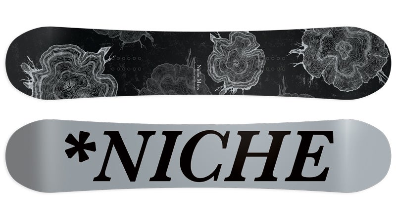
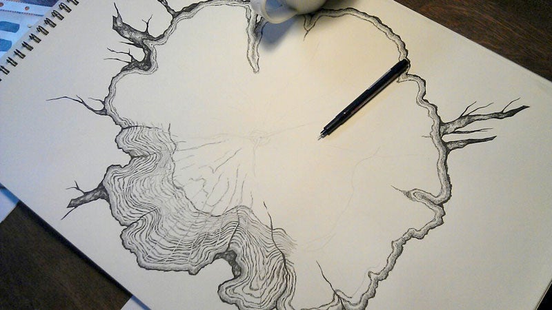
A great example of this is the (above), which was inspired by old encyclopedia illustrations. I knew what I wanted to achieve, but I needed someone to draw some tree rings. So I found an artist, Zosia Olenska, who has a really specific illustration style. She drew some absolutely stunning tree rings by hand, on paper, for me.
Then I had her scan them into the computer at a really high resolution. I take those scans into Photoshop and separate them from the background; then I start to manipulate placement.
Once I’ve created a finished piece, I’ll save it, and send it over to our manufacturer, which is over in Austria. They’ll send me a digital proof, and then they’ll mail me a physical proof on actual top sheet material so that I can check the colors.
Once I receive the physical proof, I’ll go in and make color adjustments. We don’t use lacquer on our top sheets; they have a really unique matte finish, which definitely makes anticipating how things are going to print a little mote difficult on my end. It takes some fine-tuning to get it to look sharp.
The Minx is a favorite; it’s the first all black and gray board that I’ve ever seen for women. I really get frustrated with people putting pink on everything. Pink is great, but it gets a little old and I don’t think that makes something feminine. The Minx is modern and sophisticated and feminine while still being edgy and a little bit badass.
magazine just named the Minx graphic as one of the top ten graphics of 2014. I’m really excited and proud of that piece.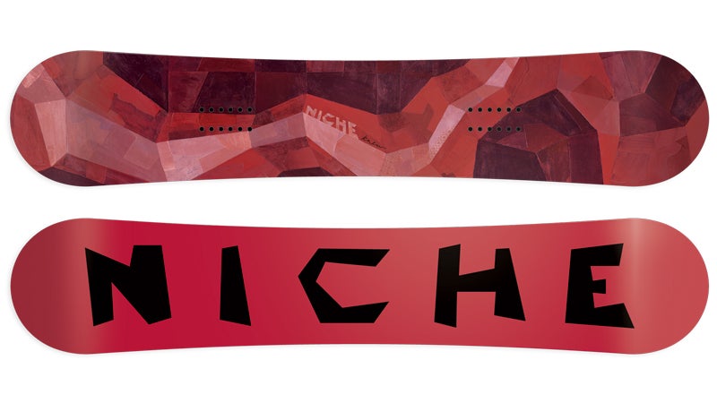
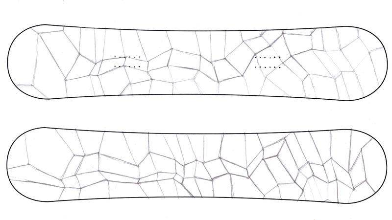
Every graphic I make has some kind of story behind it. The (above), which was done by Darren Booth, is an abstract recreation of a topographic map of the Wastach mountains, which are our mountains here in Salt Lake. He assembled and hand painted individual pieces of vintage paper to create this design.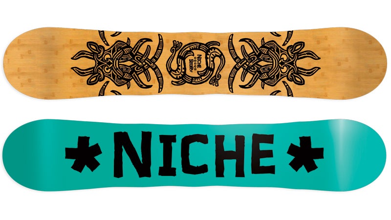
The (above) was inspired by historic Nordic tribal designs and art. Artist Travis Bone’s designs were screen printed onto an all wood, bamboo topsheet.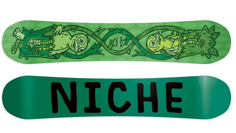
The (above), by artist Michael Sieben, is representative of the cycle of life and connectedness. If we harm the environment, we’re not just harming Mother Nature, we’re harming ourselves. During the regrowth process we have the opportunity to grow together and become stronger.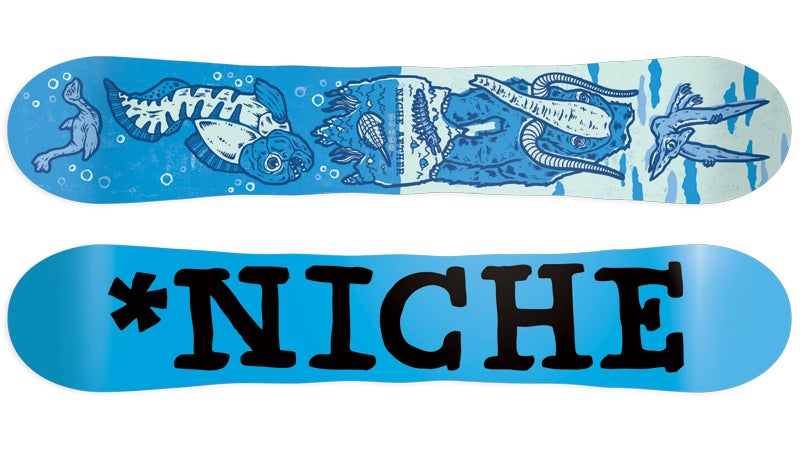
The (above), which has the dinosaurs, is super silly and I love it. It’s kind of like the cycle of adaptation and evolution of our ever-changing environment through the ages. The Aether, also designed by Michael Sieben, is probably our best-selling board. It’s sort of an all-mountain freestyle board, something you can really take everywhere, in any conditions.
For the core market, people are for sure looking for a specific riding style, but for the majority of people, I think packaging is almost everything. If you really don’t like what it looks like, I don’t think you’ll want to look down at that all season.