

Blue and orange are the happiest colors, or at least that’s what Adidas claims. It’s one of the reasons why the company chose those hues for the .
Turns out there’s room for debate on that assertion—some studies suggest that red adds to anxiety, while blue is calming. But outdoor companies rely on more than psychology when deciding on the colors to use in a new line. It’s an incredibly sophisticated process that can take years.
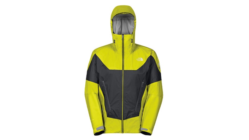
Take , which has an official director of color. Her name is Jana Hunt, and in addition to managing the company’s color decisions, she also serves as the design director of performance apparel.
The company chooses colors years before the line will go on sale. “We are going to focus on Spring 2016 colors in the next few months,” Hunt said. That’s when the real work begins. The North Face subscribes to multiple color forecasting services, which will send Hunt swatches of what colors they think will be in fashion by the end of April 2016. “Then we drop everything, roll up our sleeves, and focus on color work,” Hunt says.
Next comes a color committee, comprised of employees chosen for their fashion sense. The group then travels somewhere inspiring—think New York or Tokyo—sits down with up to 500 swatches, and debates what trends the myriad shades seem to depict.
After forming their opinions, the employees hit the streets and take pictures of the colors in real life. “We bring back images at the end of the day that complement the colors we were looking at, then we look at those colors again,” Hunt says. “That is how we capture a specific orange and come back and deliver it to the rest of the team.”
The committee brings the selections back to The North Face headquarters in California, where they figure out how the colors will look in different products. Most of the colors appear throughout the line, but the company will tweak the hues depending on the apparel. Action wear should have an edgy, bright look while outerwear is usually more subdued, Hunt says.
Just because a color is trending doesn’t mean it deserves a place in the product line. The colors still have to jive with the company’s brand. Hunt must also think about which hues provide the most visibility, and if any of them have been used recently by The North Face. “The challenging [question] is, ‘How do you harmonize those colors and make them feel fresh from previous seasons?’” Hunt says.
Even after that process is complete, the company will consult image and mood boards to keep the debate open. “People have a lot of passion and emotion around it,” Hunt says. “It shows the power of color and what it means for a brand.”