Inside Patagonia’s Top-Secret Gear Archive
A 10,000-square-foot facility not far from the former Hells Angels’ Ventura, California, headquarters—a former food canning operation, the address of which I am not to reveal—houses the Patagonia Archives, a project recently launched by the clothing company to chronicle its storied past. No signage betrays the identity of the building’s occupant or hints at the work that takes place within. The archives, you see, are not open to the public. But for one day last November, its doors opened to me. Here are some of the treasures I found inside and the stories about how they came to life.
The Badger Shirt
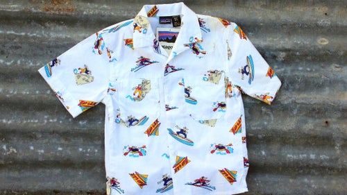
“I teamed up with my creative art director, Hal Arneson, and chief designer Kathy Larramendy, to create a refreshing new approach for kids,” writes former Patagonia clothing designer Michael Rogers. “As Yvon’s spirit-animal tag was Badger, I came up with a fun-loving badger character who devoted his time surfing, kayaking, free climbing, bouldering, and cross-country skiing wearing Patagonia-inspired apparel.
“So in about ten days, I came into the art department and showed Hal and Madelyn, then Kathy, the color comps of the Badger artwork. Hal and Madelyn signed me off immediately that I would return in a week with the finished art. In those days, before digital art software, artwork was hand painted; in this case Luma dyes on bristol vellum board with a separate black-line overlay for fabric application.
“I returned in a week with the badgers at play and the logo. I celebrated with a grand feast in the Patagonia cafeteria lunchroom. As the Badger shirt and shorts were a secret, I kept my peace about my involvement until Yvon was presented a finished prototype pair of shorts and shirt that was produced for his approval. So successful was the response that a lot of designers requested shirt and shorts for themselves. The Fall 1988 Patagonia Kids catalog had a two-page spread of the artwork, with Fletcher Chouinard modeling the graphic ensemble in Belize. It was the coolest collaborative ever.”
1972 Chouinard Equipment Catalog
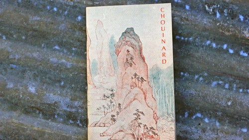
A highly coveted piece of literature—yes, literature—the 1972 catalog (Patagonia’s first) is considered a seminal contribution to the greening of alpinism because it convinced climbers to quit pitons for passive protection, like chocks. Mountaineer and photographer Galen Rowell reviewed the catalog in the 1973 American Alpine Journal, writing, “What is a commercial catalog doing in the book review section? It contains more information on the ethics and style of modern climbing than any other publication in our language.” Copies sold for 50 cents in 1972, and they’ve fetched as much as $350 in the past few years.
Doug Robinson’s “The Whole Natural Art of Protection,” a kind of essay-cum-instructional guide that makes the case for clean climbing, leads the catalog, and his opening words were as influential as any written in the climbing canon:
There is a word for it and the word is clean. Climbing with only nuts and runners for protection is clean climbing. Clean because the rock is left unaltered by the passing climber. Clean because nothing is hammered into the rock and then hammered back out, leaving the rock scarred and the next climber’s experience less natural. Clean because the climber’s protection leaves little track of his ascension. Clean is climbing the rock without changing it; a step closer to organic climbing for the natural man.
Kernmantle Rope Spool Crates
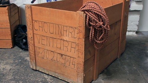
These crates date back to the early 1970s. They came from Switzerland packed with spools of kernmantle rope, which Chouinard Equipment employees would measure into lengths of 150 and 165 meters and sell as individual climbing ropes. The empty crates were apparently scattered about the growing headquarters and, as a free source of wood, repurposed into tables, benches, or office shelving. Julio Varela remembers assembling the crates into a kind of outdoor kitchen for the pig roasts he would host behind the Tin Shed.
To former Patagonia sales director Ric Hatch, the crate became a gift box of sorts. He had saved all of his samples from his years with the company (1979 to 2004) but couldn’t bring himself to toss or sell them. “I don’t know,” says Hatch, “I had an intuition that old clothing might have historical value. I just kind of kept all this stuff. I had an old Chouinard wooden crate that ropes came over from Europe in, and I just piled it all in there and brought it over to Val and Terri at the archives. Now they have it, and I have nothing except the greatest appreciation from Val.”
Original Patagonia Pile
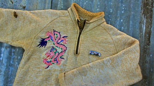
In 1976, Malinda Chouinard lucked into bolts of the hard-to-find fabric in the California Merchandise Mart, marketed as toilet seat covers. The jacket was donated by one of Chouinard’s whitewater paddling pals and fellow Do-Boy John Wasson, the husband of Patagonia label designer Jocelyn Slack. Wasson tells the story of how his jacket acquired its dragon “tattoo”:
“In the spring of 1979, I was one of three kayakers on an American Sportsman trip in Nepal,” writes Wasson. “Two films would show a group of climbers making the second ascent of Ama Dablam, and then kayakers running the Arun River in western Nepal. The kayakers were invited to come to base camp and perhaps carry some loads higher up on the mountain. The day before we flew to Lukla, I got a guy in a small, dark shop in Kathmandu to put the dragon onto my pile. He literally ‘painted’ it freehand with an embroidery machine, changing thread colors in seconds.
“I chugged my way up and down the mountain mostly alone. The tricky parts all had fixed ropes. There was talk of a second summit team, but at the end there were only Doug Robinson and me interested in going higher. We met up at the highest camp and had an almost perfect summit day followed by a slow, headlamp-lit descent back to the tent. Naturally the Dragon Pile was along for the ride. Paddling the Arun was also great, but that’s another story.”
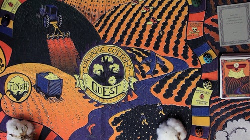
The Organic Cotton Quest Board Game
Last November, Jill Dumain, director of environmental strategy at Patagonia, left the company after 27 years to become the CEO of Bluesign. Before Dumain left, we asked her for the backstory behind the organic cotton initiative she championed in the mid-’90s and the game she invented to teach the company’s employees all about it.
“That was part of a kit we made when we were making a switch to organic cotton in the ’90s. It was an initiative that took the whole company to make happen. It was sort of this road show that we took to every employee in the company, and the game was the culmination of the training. They had to sit through slideshows and videos and lectures and different things. We modeled it after Trivial Pursuit, and we had little ladybugs, because they were the beneficial bugs, and the spaces were what you got sprayed on your farm—you know, go back five spaces—trying to make it like a board game. A few years later, some of the people who wrote the cards started reading them, and we said, ‘Man, these were hard questions!’ We were amazed at how competitive our colleagues got playing game.”
![The Freeman Payne Collection
The plaque reads: “Long-time customer, Freeman Payne (age 19), purchased these products in 1973 from Great Pacific Iron Works (Ventura Patagonia store) with an upcoming climbing trip in mind. A motorcycle injury in 1975 changed his plans and the equipment was relegated to storage for 38 years, only to be discovered years later during a move. Freeman is pleased and honored to know this equipment has found its way home to Ventura.”
Freeman Payne’s donation is like the famed 1972 catalog come to life. Pictured is an alpine hammer, Chouinard’s cleverly named Climaxe, Lost Arrow pitons, the Chouinard-Frost piolet, Millar mitts, Dachstein mitts, Schizo hats, High Altitude glasses, and Chouinard-Salewa 12-point crampons. Val Franco filled in some of the details: “Not until [Payne’s] wife died a few years ago did he know he had time-capsuled most of his purchases from the original Chouinard catalog,” she says. This includes an Ultima Thule designed by Tom Frost and most likely sewn by me.”](https://cdn.outsideonline.com/wp-content/uploads/2017/06/05/freeman-patagonia-archive_h.jpg?width=500&enable=upscale)
The Freeman Payne Collection
The plaque reads: “Long-time customer, Freeman Payne (age 19), purchased these products in 1973 from Great Pacific Iron Works (Ventura Patagonia store) with an upcoming climbing trip in mind. A motorcycle injury in 1975 changed his plans and the equipment was relegated to storage for 38 years, only to be discovered years later during a move. Freeman is pleased and honored to know this equipment has found its way home to Ventura.”
Freeman Payne’s donation is like the famed 1972 catalog come to life. Pictured is an alpine hammer, Chouinard’s cleverly named Climaxe, Lost Arrow pitons, the Chouinard-Frost piolet, Millar mitts, Dachstein mitts, Schizo hats, High Altitude glasses, and Chouinard-Salewa 12-point crampons. Val Franco filled in some of the details: “Not until [Payne’s] wife died a few years ago did he know he had time-capsuled most of his purchases from the original Chouinard catalog,” she says. This includes an Ultima Thule designed by Tom Frost and most likely sewn by me.”
![Super Gators
In 1963, Peter Carman joined a strong Harvard Mountaineering Club team on the first ascent of Denali’s Wickersham Wall. They wore insulated overboots with strapped-on crampons over their leather climbing boots. “We realized on the Wickersham Wall that it was a difficult combination, because if you wanted to climb rock, you had to take your overboots off.” The Super Gator was a fully insulated oxford packcloth upper with a steel cable at the bottom that winched to the boot’s welt. In them, climbers were able to keep their feet warm, bare the Vibram soles on their boots for rock climbing, and attach a crampon when needed for snow and ice. The logo, featuring a caped and cramponed gator, was created by climbing artist Sheridan Anderson.
“The Super Gators actually came out of a conversation I had with [Shawangunks climber] Art Gran when I was living in Jackson, Wyoming,” says Carman. “He was out in the summers, and at some point, he mentioned how nice it would be to have a gaiter that came down around the sole that you could put a little cord around to hold it down. And that was the beginning of it. And then I started working on that idea for the next few years and made a few models of Super Gator from a shop I had near the Shawangunks, in High Falls.” Carman eventually distributed them through Chouinard Equipment; when he couldn’t keep up with demand, Chouinard took over production.
Though Super Gators worked, they never really caught on. “I succeeded in making a gaiter, but in terms of commercial success, I wouldn’t say so,” Carman says.](https://cdn.outsideonline.com/wp-content/uploads/2017/06/05/gaiterscarmen-patagonia-archive_h.jpg?width=500&enable=upscale)
Super Gators
In 1963, Peter Carman joined a strong Harvard Mountaineering Club team on the first ascent of Denali’s Wickersham Wall. They wore insulated overboots with strapped-on crampons over their leather climbing boots. “We realized on the Wickersham Wall that it was a difficult combination, because if you wanted to climb rock, you had to take your overboots off.” The Super Gator was a fully insulated oxford packcloth upper with a steel cable at the bottom that winched to the boot’s welt. In them, climbers were able to keep their feet warm, bare the Vibram soles on their boots for rock climbing, and attach a crampon when needed for snow and ice. The logo, featuring a caped and cramponed gator, was created by climbing artist Sheridan Anderson.
“The Super Gators actually came out of a conversation I had with [Shawangunks climber] Art Gran when I was living in Jackson, Wyoming,” says Carman. “He was out in the summers, and at some point, he mentioned how nice it would be to have a gaiter that came down around the sole that you could put a little cord around to hold it down. And that was the beginning of it. And then I started working on that idea for the next few years and made a few models of Super Gator from a shop I had near the Shawangunks, in High Falls.” Carman eventually distributed them through Chouinard Equipment; when he couldn’t keep up with demand, Chouinard took over production.
Though Super Gators worked, they never really caught on. “I succeeded in making a gaiter, but in terms of commercial success, I wouldn’t say so,” Carman says.
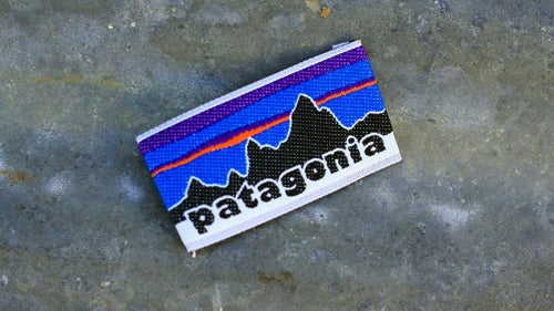
Original Patagonia Logo
According to Patagonia freelance artist Jocelyn Slack, the magic of a logo is that it’ll work if it makes the client “feel” what’s in their head. “I felt like the core collaboration was between me and Yvon, because he definitely had an idea of what he wanted. When he saw what he wanted, that was it.”
Chouinard wanted a logo for the clothing division. It was between “Patagonia” and “The Great Pacific Iron Works,” the name of their retail store. Slack was assigned the Patagonia logo and another artist the GPIW logo. Slack remembers feeling like the two artists were pitted against one another.
For inspiration, Chouinard gave Slack a climbing guide to the Fitz Roy Range of the Patagonian Andes. “So there were these old black-and-white photos, some with routes and descriptions of Fitz Roy. I did these pencil drawings of the mountains…and the big silhouette, and I think he was the one that maybe wanted some color. At one point, CEO Kris McDivitt mocked up a bunch of fonts spelling Patagonia. She asked Vincent Stanley his opinion one day, and he said the logo looked like Macy’s or Bloomingdale’s, and she threw it at him. ‘Patagonia Patagonia Patagonia’ all over the place. They kinda hashed it out, picking a font.”
The logo was first used in the Spring 1976 collection.
![The Original Pataloha Climbing Hardware Shirt
Here’s what Jocelyn Slack remembers about this 1987 design, a confluence of sea and mountains, as visualized through the cracked windshield of a beater roadtrip mobile. (See if you can spot the pitons and ice ax heads in the artwork.)
“The inspiration for the bird of paradise pitons and the flamingos came from my experience of arriving in Southern California to work in Ventura, usually in winter, driving down from [Jackson,] Wyoming. The warm air, ocean, and all the flowers, the ‘tropicalness,’ was a heady sensation, never diminished by repeat visits. The pitons are beautiful pieces of design, each unique, like a flower. Their shape looked almost birdlike, so it was interesting to weave them in with the flowers, which also look like birds.](https://cdn.outsideonline.com/wp-content/uploads/2017/06/05/patalohapitons-patagonia-archive_h.jpg?width=500&enable=upscale)
The Original Pataloha Climbing Hardware Shirt
Here’s what Jocelyn Slack remembers about this 1987 design, a confluence of sea and mountains, as visualized through the cracked windshield of a beater roadtrip mobile. (See if you can spot the pitons and ice ax heads in the artwork.)
“The inspiration for the bird of paradise pitons and the flamingos came from my experience of arriving in Southern California to work in Ventura, usually in winter, driving down from [Jackson,] Wyoming. The warm air, ocean, and all the flowers, the ‘tropicalness,’ was a heady sensation, never diminished by repeat visits. The pitons are beautiful pieces of design, each unique, like a flower. Their shape looked almost birdlike, so it was interesting to weave them in with the flowers, which also look like birds.”
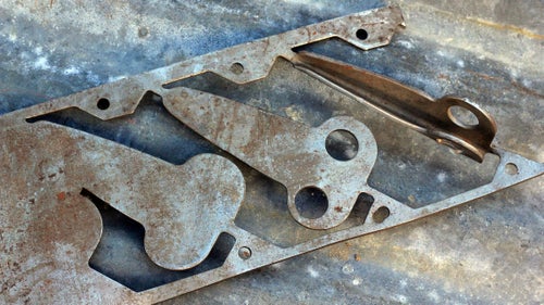
Angle-Iron Die
In his business memoir, Let My People Go Surfing, Yvon Chouinard credits genius machinist Harold Lefler for designing the dies that allowed him to keep up with growing demand for his pitons. This is a plate of chromoly steel that would be fed into a progressive die in the Lefler Tool and Die machinery in Burbank, California. The way Julio Varela, Chouinard Equipment pioneer and now owner of Ojai Clothing, explained it, chromoly plates were fed into the die much like a roll of paper on an old dot-matrix printer. A succession of stamps punched out the metal progressively until the piton took shape, and a press stamped the angle iron into the precise width and taper. The ends were sheared off, and the pitons were dipped into a black-oxide bath and then heat treated, creating Chouinard pitons’ distinctive black hue. Varela remembers Chouinard showing up barefoot and shirtless at Lefler’s Burbank facility to pick up boxes of pitons to ship to his customers. “He loved Yvon,” Varela said. “He’d do anything for him.”