

When it came to painting of Redwood National Park for an ambitious centennial art book, decided to “turn the saturation way up”—use bright exaggerated colors—with his palette of oil paints. The Brooklyn-based illustrator hadn’t set foot in the park, but had been commissioned to paint a stylized rendition of it, along with 11 other parks. After speaking with people who had been there and studied photos of the park, Carpenter thought a bold color scheme would convey the sheer size of the place. He conjured a giant redwood, drenched in red and burgundy, towering above two small travelers, with more giant trunks receding into the background.
“I was going for the look of old lithographs with those great color palettes,” he says. He referred to the early 20th century art deco travel posters, which featured happy couples exploring Technicolor versions of far-off locales: Visit Fascinating Fiji! Fly with Trans World Airlines! “And I was taking a lot of cues from the parks themselves, they’re already so vibrant.”
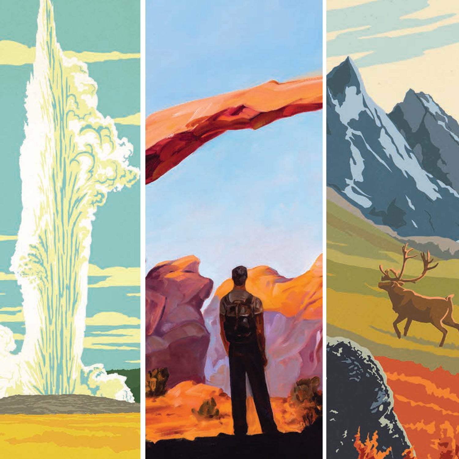
In advance of the National Park Service’s 100th anniversary in 2016, award-winning illustrator and art director Joel Anderson tasked Carpenter and five other artists with creating refreshed but retro interpretations of all of the country’s parks for , an art book that comes out November 16. The artists would need to depict the grand scenic value of each park while evoking the personal connection each person feels toward these places. “When we’d show the art to people who’d been there, they’d say, ‘That’s my spot now! It has a special place in my heart,’” says Nathan Anderson, Joel’s 24-year-old son, who also worked on the project. “Bringing back those memories was the theme.”
Five years ago, Joel decided he wanted to pay homage to the iconic , created between 1938 and 1941 for 14 national parks to encourage Americans to explore the great outdoors. He started recruiting artists he’d worked with through his Nashville firm, , who generally specialize in that retro travel poster style. To achieve that look, most ADG art is hand-lettered and drawn or painted before it’s given a final polish on the computer.
“We studied the WPA posters to make sure we were plowing new ground,” Joel says. “Luckily, the parks are so vast that it wasn’t hard to find new landscapes and color palettes.” All 71 works in the book draw from styles that characterize the Golden Age of Poster Art: rich colors, hand-lettered text, timeless scenes like a cowboy in Saguaro National Park or a couple canoeing through the Everglades.
Three weeks after completing all of the paintings in September, Carpenter and his older brother road-tripped from Brooklyn to Seattle, stopping over two weeks at three of the parks he’d painted: Zion, Yosemite, and Redwood. “I was worried I was going to be devastated that I butchered all of these places,” he says. “But I was surprisingly happy with how they turned out.” Especially the Redwood poster: “I’m really glad that I went bananas with the colors,” Carpenter says. “It feels that way when you’re there. Like you’re maybe seeing something you’re a little too small to be seeing.”