
Los Angeles is charging forward with the American bid to host the Summer Olympic Games in 2024, and while that may seem like a long way off, the city has been busy prepping since September 2015.��
The LA24 committee, a public and private partnership among, primarily, the City of Los Angeles, the Wasserman Media Group, and the U.S. Olympic Committee, is spearheading L.A.’s bid for the games. On February 16, the organization released its official branding materials��that will represent the city's bid effort. Along with an official slogan, “Follow the Sun,” there’s the all-important emblem. It portrays a flying angel, colored with a radial gradient of yellows, oranges, and purples—similar to those that fill L.A.’s skies during sunrise or sunset. Should the International Olympic Committee��choose L.A. to host the 2024 games when it makes the final decision in 2017, a new emblem and slogan would be chosen.
The angel represents the only U.S. city that wants to take��on the increasingly controversial��role��of hosting the games.��Boston was the first U.S. nominee, but Bostonians ��Olympic games are known to drop on host cities. Following Boston’s withdrawal, L.A. mayor Eric Garcetti argued that the city could, as it did in 1984, host the Olympics without significant financial burden. In fact, L.A. is , and it did so twice—in 1932 and 1984.��Public support seems to be strong, too.��A poll conducted by Loyola Marymount University this week found that out of 2,425��Angelenos, 88 percent supported the Olympic bid. “I’ve never seen that in any survey I’ve done,” one of the poll’s organizers, Brianne Gilbert,��.
Los��Angeles��is competing with��Rome, Budapest, and Paris for the final Olympic bid.��The emblem could be the face of America's first successful bid for the summer hosting gig��since 1996—so we��asked Robert��Nakata, the design director for��, an L.A.-based advertising firm in charge of bid branding materials,��about every choice the designers made to create the most meaningful emblem.
The Angel
The emblem can be interpreted as a melding of the “City of Angels” moniker and the official “Follow the Sun” slogan.��City officials��wanted to underscore L.A.’s ability to host people from all over the world—it already hosts significant��diaspora��and immigrant communities from Mexico, China, Russia, and Iran, among many others.��“Ultimately, one of the five values of L.A.’s Olympic Games bid—unity—determined the final selection”��of the angel as key element,��says Nakata. He points to the city’s founders, who were of Native American, Mexican, African, and European descent, and who nicknamed it the “City of Angels.” The series of white lines radiating from the angel’s chest are intended to invoke the rays of sunlight that grace L.A. 284 days of the year.
The angel herself��is shown with arms reaching overhead and face turned upward, like a gymnast performing an uneven bar routine, about to stick a perfect landing. “There was intention to design the figure to be athletic and dynamic, youthful and female,” he says. “We felt this was more in keeping with the progressive vision Los Angeles was forming for their Olympic bid.”
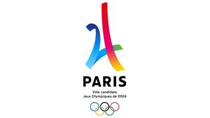
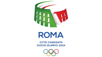
One of the key differences between Los Angeles’ emblem design and those of other bid cities is its literal approach. Paris and Rome have submitted highly abstract��representations of their city’s most notable landmarks—the Paris logo consists of the number 24 in a shape resembling the Eiffel Tower, and Rome’s features the Colosseum.��
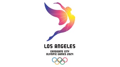
Not only is Los Angeles’ emblem a proportionally accurate depiction of a human figure, it’s clearly female. This is unusual because figurative emblems are often deliberately designed without a clear sex.
“Choosing female over male was a decision from the perception, and reality, that sports communication is already dominated by male athletic imagery,” Nakata says. “The Olympics are an event that celebrates male and female athletic achievement in equal measure. Why not represent athletic achievement through female form?”
The Secret Construction
The emblem’s curvatures are also a deliberate nod to L.A.’s aesthetics. A closer look at the design’s construction shows that it harkens back to design styles popular throughout L.A. during the earlier parts of the 20th century. The outline is composed entirely of pure circles arranged over square proportions, as seen in this graphic from 72andSunny:
The strict use of circles as a guide for the silhouette is a throwback to Art Deco or early Modernist design, two styles that characterize many of L.A.’s famous buildings from the��city’s period of unprecedented growth during the 1920s and 1930s. Buildings like the ��and��L.A.’s ��are all covered with fabulously ornate designs composed of relatively simple geometric patterns. “Most logos today tend to be more abstract,” Nakata says.��
The Typeface
The emblem’s typeface��which 72andSunny designed in-house, also reflects Art Deco and Modernist influences. “Creating a custom font based on circles and squares seemed like a logical extension of the design to create overall harmony,” Nakata says. Each letter is simple and geometric, which Nakata says “feels like older Los Angeles, because 3D type on buildings tended to be constructed this way [in the mid-20th century].” Take, for example, the uniform block text on the , which was built in the early 1930s in the Art Deco style.��
The Big Reveal
The bid emblem has received a widely warm reception among Angelenos. Mayor Eric Garcetti ��it as a rightful representation of the “hard work, creativity, and ingenuity” reflected in the Angeleno spirit. “I’m a fan,” says Ruth Wallach, the director of the Arts and Humanities Libraries at the University of Southern California. “It reminds me of those smoggy sunsets L.A. does so well. Other places have good sunsets, but the smog in L.A. gives our own such magnificent color.”