

Design veterans know that the difference between a blockbuster product and a total flop isn’t always about materials or high-tech features. Sometimes it all comes down to color—and consumer preference is a notoriously moving target. So the rainbow of hues popping out on the show floor this season is no accident: gear companies have done loads of homework to discover the precise shades that will convince shoppers to open their wallets.

A few years ago, bright, primary colors dominated outdoor gear and apparel, in part because these high-visibility shades serve a safety function in alpine whiteouts. But garish hues are waning in popularity. “Now, [outdoor] colors are more subdued, because people are buying fewer items and expecting to use them as crossover pieces into lifestyle activities,” said Ember Todd, Chaco’s color and trend manager. So which shades promise to sell well next spring?
“That’s the million-dollar question,” said Mark Woodman, a color trends consultant and former president of Color Marketing Group (CMG). “Consumer studies indicate that up to 85 percent of every purchasing decision is based on color, so if you get it right, you get it very ���������.”
Searching for the Next Big Thing
Many outdoor manufacturers subscribe to at least one color forecasting service, like CMG or Worth Global Style Network (WGSN). Such services poll representatives from various industries to discuss what they’ve been seeing. And in recent years, forecasters have become more responsive to the outdoor industry.
Instead of making do with generic predictions, manufacturers can now buy color books targeted specifically to outdoor sports—and can receive them earlier, to allow for the longer lead times required to produce technical gear. Outdoor color previews for S18 were distributed in May 2016, with full forecasts arriving in June.
Gear designers tailor those forecasts to suit their particular brand’s character. They also supplement them with their own research to generate what Todd calls “data points.” Jana Hunt, director of global color for The North Face, logs one or two annual trend-spotting trips to places such as Brazil and New York. Designers also attend other industries’ conventions and fashion shows.

“Color trends start with runway tastemakers, then trickle down to the rest of the market,” said Todd.
So are hikers really choosing their shirts based on Christian Dior’s picks? Yes, insist color experts. “The fashion industry is very good at reading the street trends, which end up on the runway, which in turn influence other industries,” said Woodman.
Take the current tone-on-tone trend (a design that combines two shades of the same color). Todd first noticed it on runways last year. “Now, we’re seeing it in athletic shoes,” she said. “That category used to be about contrast and multiple colors, but now, running shoes are solid from heel to toe.”
What if shoppers don’t want tonal trail runners? Interestingly, manufacturers don’t seem to be asking them. Instead, designers follow the Steve Jobs philosophy: people don’t know what they want until you show it to them. “Initially, when we see new trends, we may feel uncomfortable, but with repeated exposure, we get more and more used to it,” Todd said.
That was true for now-popular gray, said Woodman: “After the financial crisis of 2008, people started gravitating to reassuring gray flannel.” Gray took a few years to hit its stride, but now it’s showing up not only in apparel (which gives consumers a low-commitment way to try out new colors), but also in longer-term investments, such as kitchen cabinetry, blinds, and backpacks. Mountain Hardwear’s Rainshadow backpacks (new for S16), for example, exhibit tone-on-tone combinations of black/gray and gray/blue.
Tough Customers
Forecasters and designers read trends on a global level, but retailers have to choose the right colors for their customers—and those preferences vary by region and activity.
“New England is more conservative, so we write off brighter colors, especially for men,” said Mike Donohue, co-owner of Outdoor Gear Exchange in Burlington, Vermont. “Black still is number one.” But in Colorado’s Steamboat Springs, local shoppers are keen on color. “They like more saturated colors, and don’t want black pants unless they’re from New York,” said Vicki Oyster, a buyer at 47-year-old Ski Haus. The South is also more interested in color, with men gravitating toward bright blues and greens and women choosing brights across the spectrum, said Trina Fornerette-Ballard, REI’s senior category merchandising manager.
Color tolerance also varies by sport and gender. Even in neutral-loving New England, says Donohue, mountain bikers and hardcore skiers tend to choose powerful colors such as chartreuse and orange. Occasional skiers prefer subdued shades that can double as workwear. Paddlers tend to be the most conservative, opting for the traditional palette of browns. Pink is notoriously polarizing—some women embrace it, while others loathe it. And although some men shy from color, not all do. “Boomers are saying ‘I’m not aging!’ by buying color, so we’re seeing older men choosing orange sneakers,” said Woodman. What all groups have in common is hesitation about yellow, said Kate Larramendy, design and sustainability director for Toad&Co. “Everyone loves the idea of yellow but is afraid of it, assuming that it takes a certain skin tone,” she said.
Hardgoods such as backpacks and tents offer buyers even fewer options: most come in just one color, so shoppers are more likely to accept whatever meets their criteria for weight, capacity, and price. When it comes to tents, they’ll even choose yellow: the sunny hue makes tent interiors feel bigger and cheerier.

Feeling Blue
What buyers won’t see in S17: innocent, happy-go-lucky shades like bubblegum pink or seafoam green. “Color reflects what’s happening in the world,” said Todd, and the present onslaught of political upheavals, rape scandals, mass shootings, and environmental degradations are dimming buyers’ optimism. “We’re seeing saturated, serious colors with more complex overtones,” said Todd.
Instead, look for a wave of blue, which Woodman sees as an outgrowth of gray’s recent reign. “Blue has a universal appeal and richness to it that isn’t frivolous,” he said. The neutrals that have always dominated the outdoor realm will remain dominant, only now, they’re tinted with pinks, purples, and other mineral tones that create more saturation. “They look moodier,” said Todd.
Also look for androgynous hues. “We’re sharing more colors between men and women, and getting away from traditional female colors in favor of more progressive ones,” said Hunt. Tinted neutrals serve that goal, and fit with buyers’ desire for versatility: sienna transitions to après-sport more easily than chartreuse.
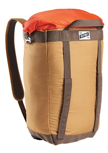
Thus, the bright colors that once characterized entire pieces of outdoor gear are now used as accents, said Chris Gill, design manager at Kelty. New for S17, the Hyphen Pack Tote uses classic-looking textured fabrics throughout and employs pop colors only in the roll-top collar.
Strong colors also appear in retro color-blocking, which remains popular for S17 even as tone-on-tone layering gains steam. “Traditionally, [The North Face] has had a lot of bold color contrast, in pieces like the Mountain Jacket and the Denali Jacket, so it’s an iconic look for us,” said Hunt.
It just goes to show that the hot colors aren’t always about the new—sometimes, everything old just feels new again.