


Back in 1992, scientists at UCLA made a surprising prediction . Since women’s marathon times were improving more quickly than men’s, they forecast that women would surpass men in 1998. While that didn’t come to pass, the idea that women might be closing the gap in endurance races persists, thanks to the feats of athletes like Jasmin Paris, the ultrarunner who in the 168-mile Montane Spine Race in Britain earlier this month, and Camille Herron, who beat the entire field while setting a women’s 24-hour running record in December.
But you can only learn so much from individual stories, no matter how remarkable. That’s where in the Journal of Strength and Conditioning Research comes in. A team led by Swiss researcher Beat Knechtle analyzed male and female results from the Boston Marathon between 1972, when women were first permitted to enter the race officially, and 2017. (That means last year’s hypothermic sufferfest isn’t included, unfortunately.)
Before diving into the results, it’s worth asking yourself: what is the most relevant part of the data to look at? Should we be analyzing the difference between the male and female winners? The overall averages of the whole field? The difference between the men’s and women’s top ten? Top 100? Each of those subsets will tell us something different, with different strengths and weaknesses, and the story the data tells will depend on which of those subsets we choose to look at.
So, with that caveat in mind, let’s take a bird’s-eye look at five different ways of slicing and dicing the same results. (The data shown runs from 1978 to 2017, because the available data between 1972 and 1978 seemed suspiciously sparse. When the researchers asked the race director about it, his reply was “The only results we have are those recorded by the athletics officials, who often went home before the last finishers completed the course.” Times have changed, obviously.)
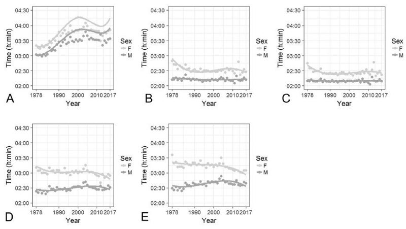
Box A is the average time for all male and female finishers in the race; B is the winning times; C is the average of the top ten; D is places 21 to 100; and E is places 101 to 200.
The key thing to notice is how different the various curves look. Whether men and women are getting faster or slower, and whether the gap is narrowing or widening, depends entirely on where you look.
Looking at the overall results (A), the dominant trend is that runners got a lot slower until around 2005, then started to stage a bit of a comeback. The big decline was probably fueled by broader participation, meaning plenty of casual runners and an increasing proportion of masters runners compared to the relatively small and serious cohort that showed up in the 1970s. If anything, that’s even more true for women: those who overcame the barriers holding them back from Boston in the 1970s were a fairly elite and self-selecting group, which is why their average time was actually closer to the men (9.8 percent behind from 1972 to 1981) compared to later decades (11.1 percent and 10.4 percent in the following two decades).
For the winners (B) and top 10 (C), one of the mild surprises is how flat the men’s trend looks. What it takes to finish top ten, and even to win, the men’s race at the Boston Marathon hasn’t changed a whole lot over the last four decades. For women, there was a period of swift improvement until the mid 1980s, after which the curve mostly flattens out. Joan Benoit, who won the first women’s Olympic Marathon in 1984, was able to pick up her first Boston win in just 2:35:15 in 1979. By 1983, she was winning Boston in 2:22:43. That would still win in most years.
It may be the “near-elite” athletes in places 21 to 100 (D) and 101 to 200 (E) that offer the most interesting snapshot. Here, the men are getting slower and the women are getting faster, resulting in curves that make you wonder if the gap really will shrink to nothing at some point. If the overall average trends are dominated by sociological factors (how popular is running? what is seen as appropriate training?), and the winning times are more reflective of physiological limitations (how fast can oxygen be delivered to the muscles in a male versus female body?), the near-elite data is a middle ground where both factors matter. Who is encouraged to take sports like running seriously enough to bump up against their physiological limits?
Overall, the average difference between men and women was 10.7 percent, which fits remarkably well with other studies that have found average differences of 10 to 12 percent across a wide variety of athletic events. But to me, the biggest takeaway from people like Jasmin Paris and Camille Herron isn’t what they tell us about some hypothetical future trend; it’s that what they’re doing right now is amazing, period.
My new book, , with a foreword by Malcolm Gladwell, is now available. For more, join me on and , and sign up for the Sweat Science .